Color psychology: How roller blind colors affect the atmosphere of a room
.jpg)
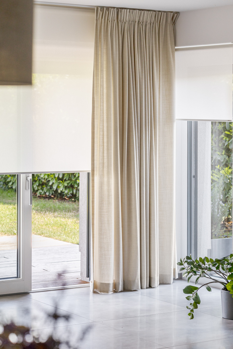
Light colors
Psychological effect: Light colors evoke a feeling of cleanliness, airiness, and calm. The room feels more open and pleasant. White and beige are associated with simplicity and harmony, light gray with modernity and elegance.
Practical impact: Light colors reflect light back into the room and outside, keeping the room lighter and cooler in summer. They also optically enlarge the space - a small room appears larger and airier. A light blind doesn't compete for attention and allows the other elements of the interior to shine.
When to choose them: Small rooms you want to optically enlarge. Windows facing south or west, where you need to reflect heat. Rooms where you spend a lot of time and want peace and light.
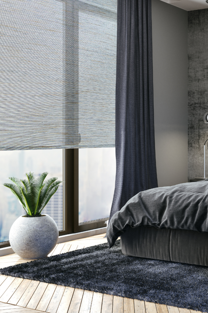
Dark colors
Psychological effect: Dark colors create a feeling of coziness, intimacy, and elegance. The room feels sophisticated and dramatic. Dark fabric adds depth and framework to the interior.
Practical impact: Dark colors absorb light and heat, making the room darker and warmer in summer. They optically reduce space, which can be an advantage in overly large rooms - they add coziness.
When to choose them: Large spaces you want to make cozier. North-facing windows where the light is not intense. Modern interiors where you want to create a dramatic effect.
Warning: In small rooms, dark colors can "compress" the space and feel stuffy. If in doubt, a light color is a safer choice.
Why neutral colors work: They have a calming effect, are unobtrusive and easily combined with any furniture or interior style. They are timeless - you won't get tired of them even in a few years and they suit practically any room.
Difference between warm and cool shades: Even neutral colors have their shades. Warm neutrals (beige, cream, sand) create a cozy atmosphere and suit more classic or rustic interiors. Cool neutrals (pure white, cool gray) look modern, clean, and minimalist - perfect for contemporary interiors.
Tip: If you're unsure whether a shade is warm or cool, place it against a white sheet of paper. If the fabric looks yellowish or pinkish, it's warm. If bluish or grayish, it's cool.
Green: The color of nature, calm, and regeneration. Subtle green shades (sage, eucalyptus) work great in bedrooms, where they promote rest. More vibrant green can be interesting in living rooms or studies.
Blue: Has a calming effect, promotes concentration and relaxation. Light blue is ideal for the bedroom or study, darker blue in the living room.
Ochre and terracotta: Warm earthy tones create a cozy, inviting atmosphere. They work great in living rooms or dining rooms, where you want to create a feeling of warmth and hospitality.
Note: Bold colors quickly become tiresome or may not match a change in interior. Today you may like bright ochre, but in two years, when you change the furniture, it may feel jarring.
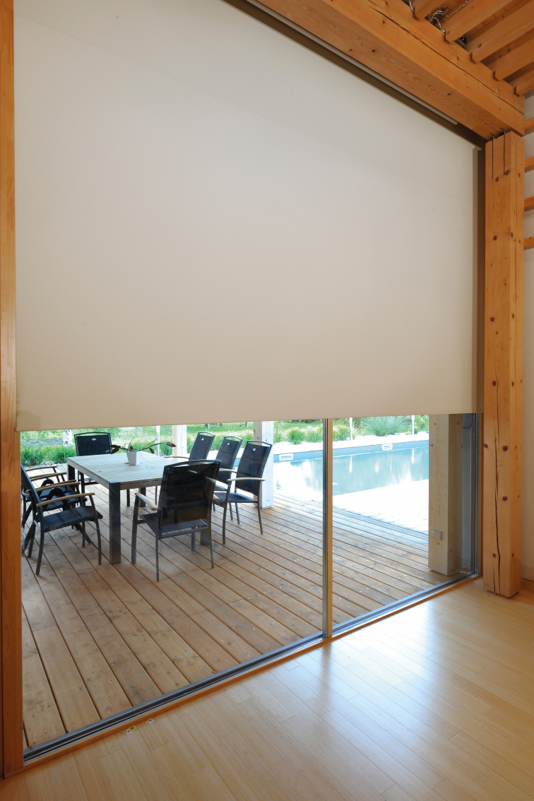
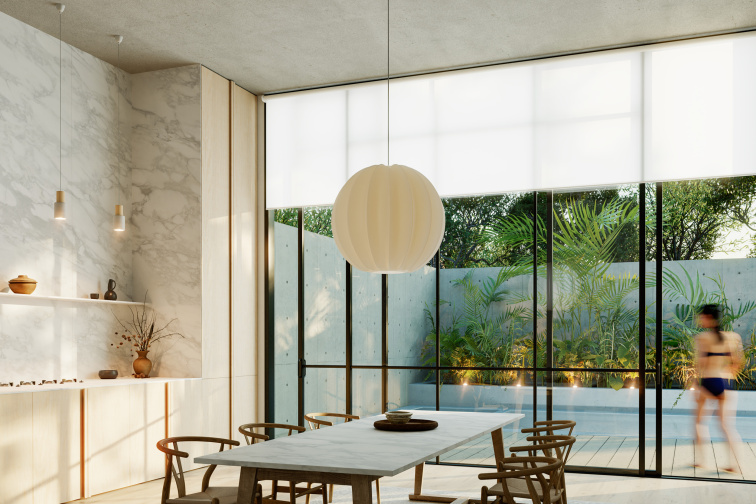 Light fabric blind in the dining room
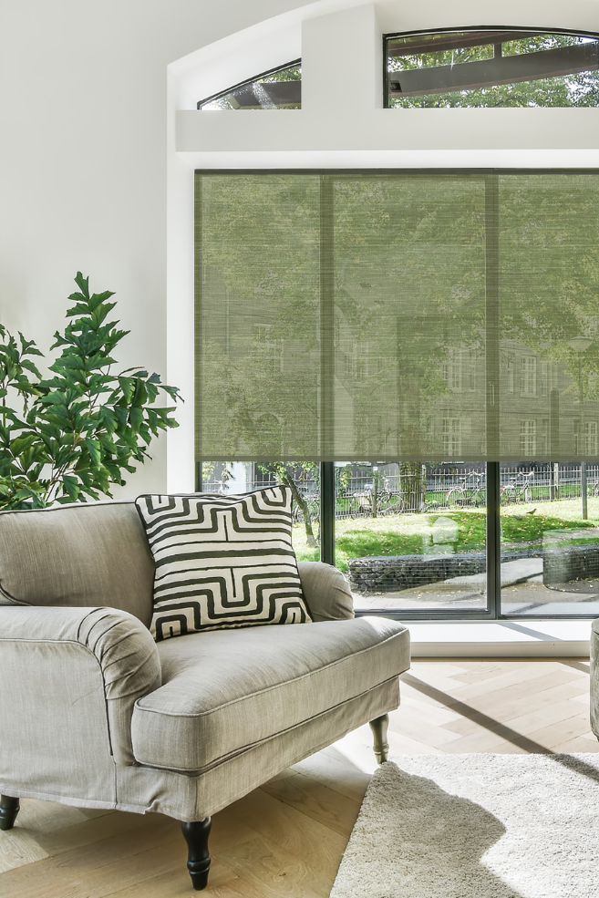
 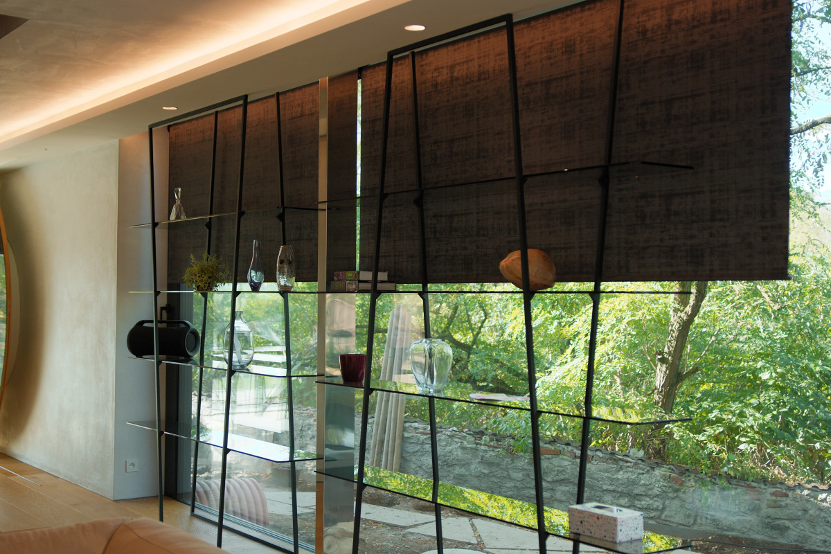 Brown fabric blind in the living room
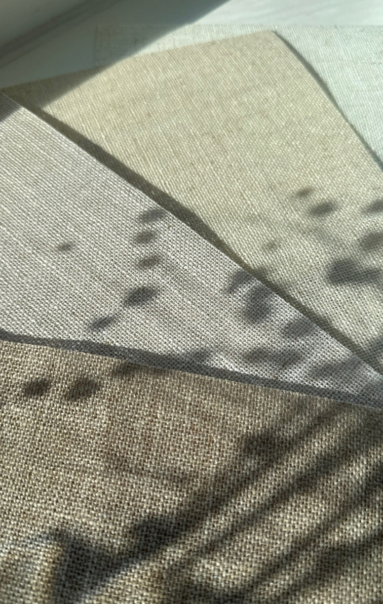
It often happens that a shade that looks nice on the screen or in a catalog at home in natural light seems completely different - lighter, darker, or with a different undertone. That's why it's best to assess the color directly in your home. The fabric behaves differently in the morning, than in the afternoon, and differently in the evening under artificial lighting. Place it by the window, observe how it filters light. Check if it matches the furniture and the overall atmosphere of the room.
At Accublind, you can order fabric samples and try them directly in your interior. It's the simplest way to be sure that the chosen color will work exactly as you expect. And good news? The price of the samples will be deducted from the final purchase, so it's an investment that pays off.