Roller blinds as part of your interior: How to match them with colours, furniture and your room style
Choosing a roller blind is not just about covering a window. It is an element that can unify an entire interior - or, conversely, subtly throw it off. Colour, material, texture - all of these play a role. And that is precisely why it is worth approaching the choice of a roller blind in the same way as choosing the colour of your walls or furniture. So how do you match a roller blind so that it naturally fits into the space, complements what you already have in the room, and works well in the long term? That is exactly what this article is about.
Start with the atmosphere you want to create in the room
This is your starting point. Before you start browsing sample books, ask yourself one simple question: What feeling should the room evoke?
Calm and cosy? Fresh and airy? Modern and minimalist? Or bold and design-forward? The colour of the roller blind should support this feeling - not work against it.
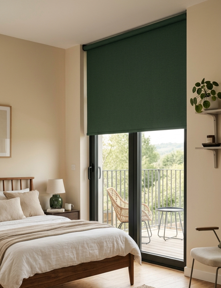
- If you have a calm, natural interior → choose beige, sandy or soft green tones.
- If the interior is modern and clean → white, light grey or, conversely, a striking dark contrast work brilliantly.
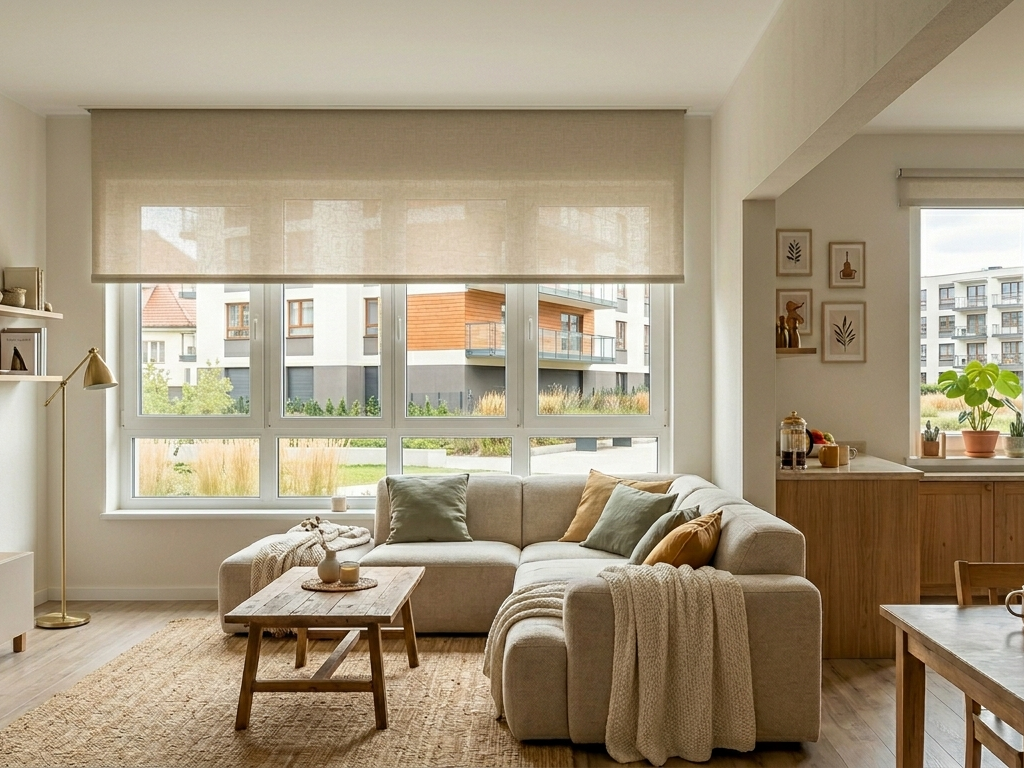
- If you want cosiness and warmth → earthy tones, warm brown or olive simply work with wood.
Colours? Match or contrast?

This is where most of the uncertainty arises - and yet there are only two basic strategies.
Option A: Tone on tone
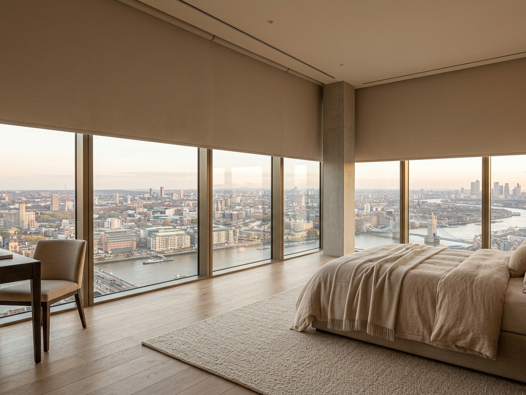
The roller blind matches the colour of the walls, floor or a larger surface in the room (such as the sofa). The result is a harmonious, calm interior where nothing is distracting or overpowering. A great choice for a bedroom, smaller room or anywhere you want calmness and cohesion.
Option B: Subtle contrast
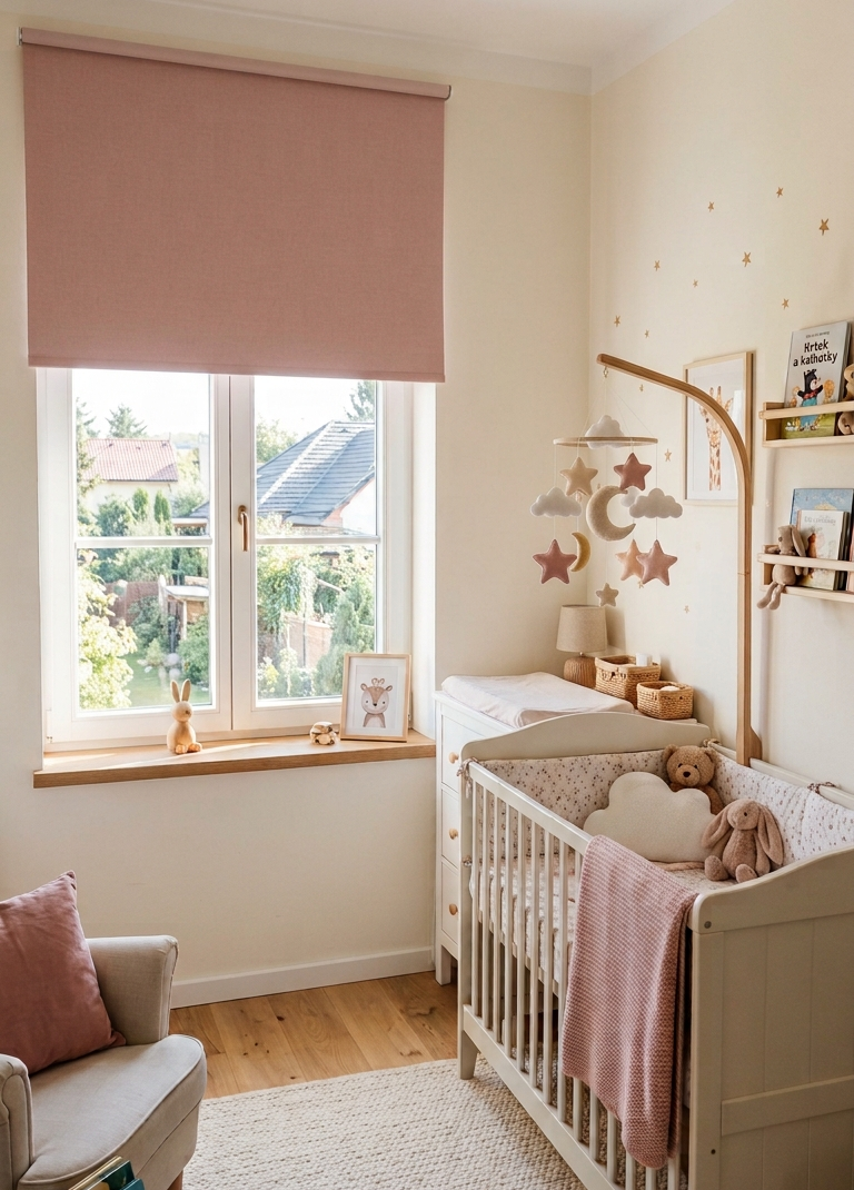
The roller blind is intentionally one or two shades darker or lighter than its surroundings. This gives the space depth; the roller blind is visible - but does not overpower the interior. It is a more interesting design solution, but one that requires a little courage and sensitivity.
Important: The contrast should always be deliberate and controlled. A random colour that does not fit anywhere is not contrast - it is a mistake.
Beware of light: Colour changes throughout the day
This is one of the most common mistakes when choosing roller blinds. You choose a colour from a paper catalogue or from a photo on your monitor - and at home it looks completely different.
Why? Light in the room changes - morning versus afternoon, a north-facing versus a south-facing window, artificial lighting in the evening. And each of these situations affects the colour of the fabric.
Light-coloured roller blinds diffuse light and brighten the room. Dark ones absorb it, soften it and give the room a more intimate atmosphere.
Tip: Always hold the fabric sample directly against the window and observe it at different times of day. Only then make your decision.
Material and texture: A detail that says more than you might expect

Colour makes the decision, but texture completes it. The same colour can look completely different in two different materials - and that is exactly what makes the difference between an average and a successful interior.
- Smooth fabric → a clean, modern look that is easy to maintain.
- Subtle texture → a cosier and “softer” impression that adds depth to the room.
- More pronounced weave → becomes a design element in its own right.
Tip: When choosing, examine the fabric not only visually but also by touch. The way it feels in your hands is how it will feel in the room.
So what should you match the roller blind with?
The good news: you do not have to match the roller blind with absolutely everything in the room. It is enough to choose one or two anchors - elements that it will visually relate to.
The most common choices are the floor, furniture, curtains or window frame. The roller blind should respond naturally to these elements - be an extension of them, not a foreign element that has somehow wandered in.
A small or large space? Different rules apply.
Smaller rooms → choose light colours that are as close as possible to the wall colour. A roller blind that blends into the background will make the space appear larger and will not make it feel cramped.
Larger rooms → here you can afford to be more adventurous. Darker shades or more pronounced tones will not suffocate the space; on the contrary, they will make it cosier and give it character.
Roller blinds and interior style: What naturally goes with what?
Scandinavian and minimalist style
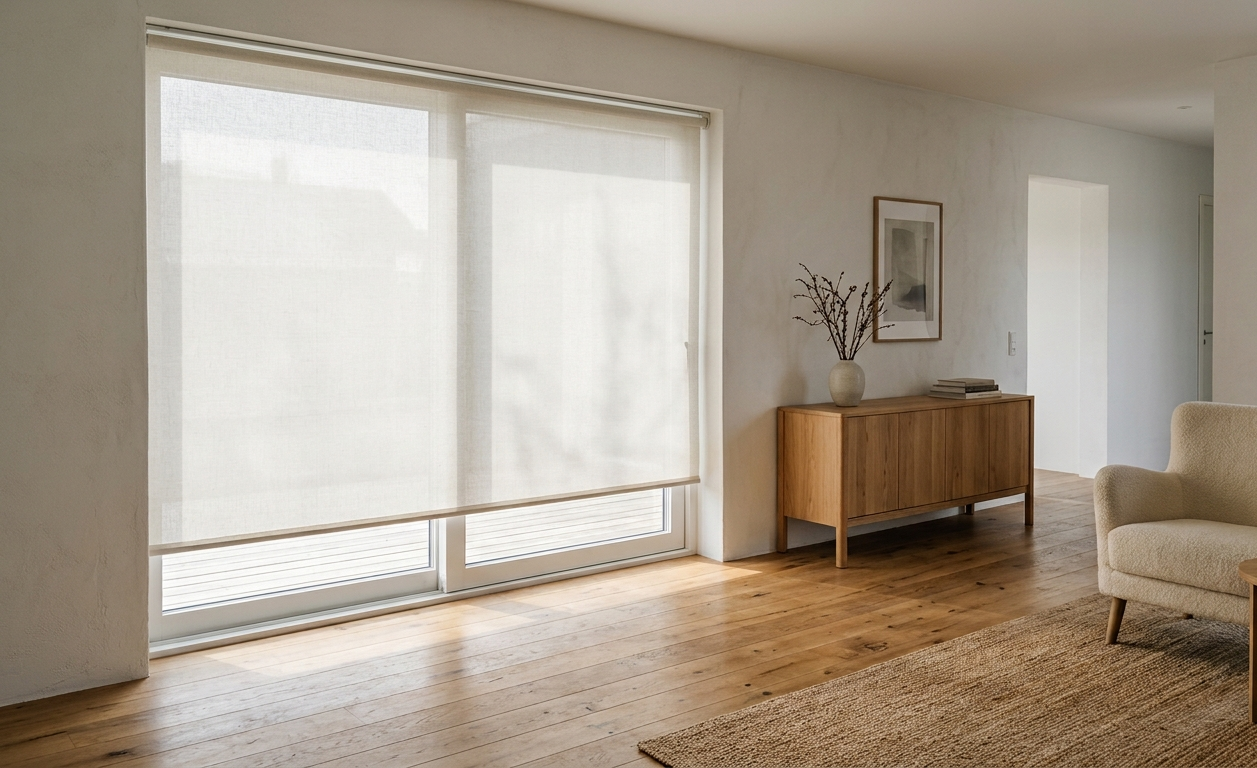
Light neutrals belong here - white, cream, light grey or soft beige. Fabrics with a clean, smooth structure. Nothing too striking, nothing that would distract from the simplicity.
Industrial style
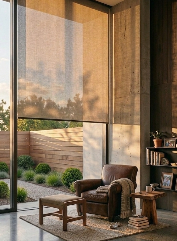
This is where dark tones belong - anthracite, graphite, dark grey or even black. The roller blind becomes a deliberate, striking element rather than a neutral backdrop. It works brilliantly in combination with metal elements or concrete.
Natural and boho style
Warmth and texture are key. Beige, sandy, brown, olive or terracotta. Fabrics with texture and a natural appearance. An ideal combination with wood, wicker or linen. A roller blind that looks as though it has grown naturally into the interior.
Modern and contemporary style
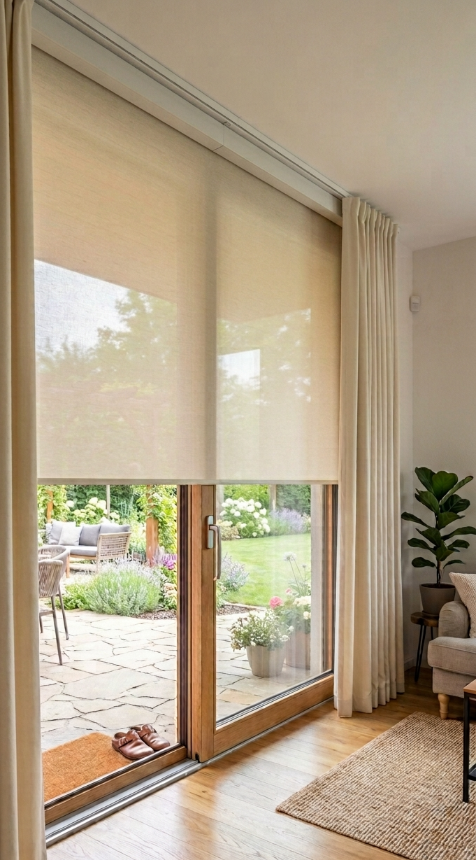
Here there is the most room for experimentation. A neutral base can be enhanced with colour, and roller blinds can be layered with curtains. Both muted tones and deliberate contrast work well. The key is consistency - even if the choice is bolder, everything should make sense together.
The most common mistakes when matching roller blinds
❌ Choosing based on a single detail
The roller blind matches the cushion, but not the rest of the room.
❌ An overly striking colour without context
Interesting at first, but over time it starts to overpower and distract.
❌ Ignoring the light
The colour looks great in the showroom or on the monitor, but at home it is a different story.
❌ Trying to match absolutely everything
When everything is perfectly coordinated down to the last detail, the interior can seem flat and lifeless. A little spontaneity does it good.
The easiest way to be sure: Try a sample at home
Theory is useful, but reality is what counts. No article, Pinterest photo or visualisation can tell you how the fabric will look on your window, in your light and in your interior.
A fabric sample will show you:
- How the colour responds to the light at different times of day,
- Whether the texture complements what you have in the room,
- And most importantly—what feeling it evokes in you.
And that is precisely what no photo can replace.
Conclusion: The roller blind as the finishing touch to the interior
A roller blind is not just a practical element. It is part of the design and can either enhance or disrupt an interior. The right choice is not about finding the “right colour”. It is about finding a solution that suits your space, your light and your style. When a roller blind fits in naturally, you may not even notice it - and that is actually the best compliment it can receive.
Looking for inspiration? Take a look at our Pinterest, where we share installations from real interiors. And when you are ready to make a specific choice, our configurator will guide you through the entire process step by step.
FAQ
Should the roller blind match the wall or the furniture?
It does not have to match everything. It is enough for it to naturally relate to one dominant element, such as the floor or sofa. Overall harmony is what matters, not an exact colour match.
Is it better to choose a light or dark roller blind?
It depends on the room and the atmosphere you want to create. Light-coloured roller blinds make the space look larger and feel airy - a great choice for smaller rooms. Dark ones add depth and cosiness - they work naturally in larger spaces or wherever you want more intimacy
How much does light affect the resulting colour of the roller blind?
Significantly. The same fabric can look different in the morning, afternoon and evening - and also depending on the window’s orientation. That is why it is always best to see the sample directly in the room and observe it under different lighting conditions before making your final decision.
Is it better to have roller blinds in the same colour throughout the home, or to adapt them to each room individually?
Both approaches work - but it depends on the style of the home. If you want a uniform, calm look throughout the spaces (for example, as seen from the street), choose one colour everywhere. If each room has its own character, adapting the blinds from room to room makes more sense.